
Project Connect’s “corridor” study — without corridors!
11 November 2013
Project Connect’s central Austin study area (so-called “Central Corridor”)
♦
Coming soon, on November 15th, is the momentous day when the Project Connect (ProCon) “team” (however that’s defined) is scheduled to make its recommendation for an inner-city sector (“sub-corridor”) for urban rail — i.e., a light rail transit (LRT) starter line. This is supposed to be the result of a study purportedly aimed at identifying just the right “corridor” for an urban rail line connecting to the core area of the city. However that recommendation may go, the fact remains that ProCon’s urban rail study has been fundamentally flawed by disastrous faults, weaknesses, and errors.
Even leaving aside all the data errors and anomalies (see Huge problems cited with Project Connect’s urban rail study data), what seems to be the program’s really catastrophic conceptual fault is its approach in (1) defining a huge Central study area (“Central Corridor” — see map above) and then (2) because this huge “Central Corridor” is so unwieldy, subdividing it into sectors (which they must call “sub-corridors”) that are effectively treated in isolation from one another.

Project Connect’s “Central Corridor” (study area) with “sub-corridors” (i.e., sectors). (Click to enlarge.)
In effect, this subdivision of the study area has created an array of balkanized sectors that are analyzed more as autonomous geographic-demographic “islands” than as components essential to work together as a whole. As a result, actual, realistic, workable travel corridors have been obscured by all this.
What’s a travel corridor, anyway?
So, what exactly is an urban travel corridor? Until now, there’s usually been no dispute in Austin — as per widely accepted transportation planning practice, travel corridors in Austin (and virtually all other metro areas) have typically been laid out as fairly narrow swaths following travel patterns (and, almost always, some kind of existing transportation right-of-way) and encompassing population and employment in fairly long, narrow strips of the urban area. Wikipedia provides a particularly succinct and useful definition:
A transportation corridor is a generally linear tract of land that contains lines of transportation like highways, railroads, or canals. Often, new transport lines are built alongside existing ones to minimize pollution.
A possibly even better idea of urban travel corridors can be derived from how they’re depicted in maps. Below are several examples of corridor planning maps from several other communities.
♦
♦

LEFT: Houston urban corridor planning map (City of Houston). RIGHT: Portland high-capacity transit (HCT) planning map (Transport Politic).
Both of these maps (Houston left, Portland right) show urban travel corridors as very elongated bands following major transportation features such as arterials and rail lines.
Note that in each case, the core is not designated as a “corridor” — in Houston, it’s the Core Pedestrian District; in Portland it’s simply the Central City.
♦
♦

LEFT: Travel corridor in Cleveland (FHWA). RIGHT: Travel corridor in Loveland, Colorado (City of Loveland).
Multiple urban corridors can be designated for study, or the focus can be on individual corridors. In these cases, individual corridors have been selected for more intensive study — one in Cleveland, left, and one in Loveland, Colorado, right. But note that these corridors are still elongated, narrow, and shaped to comform to predominant travel flow patterns.
♦
♦

LEFT: Denver — planned transit corridors (RTD). RIGHT: Kansas City — Proposed streetcar expansion corridors (NextRail-KC).
Once again, transit corridors are typically designated as fairly narrow, often shaped around existing travel facilities (roadways or railways). They do this because they are designed to designate travel movement patterns, i.e., traffic flows. The adjacent areas are often regarded as “watershed” for ridership, i.e., the “travel market” from which ridership to the proposed transit services could be attracted. It’s the demographics and other characteristics in these corridors that are important, not areas of huge urban sectors remote from these corridors.
♦
♦

LEFT: Washington — potential transit study corridors (WMATA). RIGHT: Sacramento — Designated commercial corridors (City of Sacramento).
What’s significant in these cases (Washington, DC left, Sacramento right) is the addition of arrows to the corridor designations on the maps to emphasize that these are travel corridors.
♦
♦
ProCon’s “sub-corridors” = isolated enclaves
Yet Project Connect’s “sub-corridors” resemble none of these actual case examples — maybe because they’re actually urban districts or sectors, not true travel corridors. Indeed, these sectors have virtually nothing to do with actual travel corridors following traffic patterns. Instead, in the way they’re used by ProCon, they resemble, to some extent, rather large travel analysis zones (TAZs, also called traffic analysis zones or transportation analysis zones).

LEFT: Baltimore TAZ map (Baltimore Metropolitan Council). RIGHT: Minneapolis TAZ map (Metropolitan Council).
But ProCon’s sectors (“sub-corridors” — see map at beginning of post) weren’t intended to be TAZs, and they don’t function that way at all. TAZs (typically based on small geographic units such as census tracts or electoral precincts) are designed to be the basic geographic components to provide data inputs for a coordinated, integrated, metro-area-wide transportation network.
Project Connect’s sectors, in contrast, seem more designed to pit one part of the city against another — to function more as neighborhood enclaves to be assessed for their isolated demographics and “level of misery” (poverty, congestion, etc.) in a competitive showdown within a game of “Which sector deserves the urban rail prize?” It’s astounding that this charade is presented as a form of officially sponsored urban transportation planning.
Rather than tracking existing, logical corridors, almost all of these sectors sprawl over vast stretches of the inner city. The “Lamar” sector, for example, extends westward as far as Shoal Creek — approximately 1.5 miles from the Guadalupe-Lamar (G-L) corridor, and up to two miles wide — and encompasses over 2,900 acres, about 4.6 square miles. It includes both Shoal Creek Blvd. and Burnet Rd. as well as Guadalupe-Lamar. Yet, curiously, despite all this stretching of the corridor, ProCon planners have stopped the boundaries of the “Lamar” sector short of Loop 1 (MoPac Freeway) and, even worse, they’ve ruled out a logical extension as far as U.S. 183.
The “Mueller” sector, widening to approximately 2.5 miles in girth, sprawls even further, encompassing a chunk of the Hancock neighborhood, north of UT, and then most of northeast Austin, as well as the relatively small Mueller development site, in almost 4,000 acres, more than 6.2 square miles.
Not only have the sectors been gerrymandered, the data Project Connect is attributing to them has been gerrymandered as well. The “study” purports to be focused on getting the proper routes (through the proper sectors, of course) to the “Core” sector (from which all other sectors are banned) … yet in not one single sector have the actual travel-related conditions of a major potential transit route corridor been even mentioned, much less tallied, examined, or analyzed.
The existence of corridor travel patterns, and particularly of available physical corridors (e.g., fairly wide arterials in sectors such as “Lamar”, “ERC”, and “MLK”), are critical factors that nevertheless seem immaterial to ProCon planners. Thus, rather than assessing corridors to the core, the Map Book provides (for each sector in the study area map) a chaotic riot of “congested” streets (using dark and bright red colors designating “congested” and very congested” conditions), in virtually every direction. It doesn’t matter if a roadway heads the wrong way — everything counts in registering a sector’s score in the “congestion” misery index.

LEFT: Congestion by sector in 2015. RIGHT: Congestion by sector in 2035.
Some of this demographic and “misery” data could be relevant — if it were focused on actual travel corridors. The walking-distance “ridership watershed” of an inner-city transit corridor is usually about a mile either side of the the center of the corridor (which is usually a likely right-of-way for the proposed transit facility); this assumes an average pedestrian access of a half-mile to stations (within a 0 to one-mile range). Total population, density, employment, transit-dependency, income level, poverty, traffic congestion (especially in the directional flow pattern), and other indicators are all relevant within this travel corridor for assessing its potential.
Catastrophic methodological fault
However, there’s a much more fundamental (and disastrous) problem than either the configuration or the function of Project Connect’s designated sectors. Perhaps the most serious flaw in ProCon’s urban rail study methodology — actually, catastrophic, because it fundamentally impairs the integrity of the whole process — is that the actual travel corridors are not only basically ignored as workable corridors, but also are truncated and segmented by ProCon’s arbitrary slicing up of the urban area.
If you’re evaluating a travel corridor, you must evaluate the corridor as a whole — what it connects from, to, and in between; what the populations and densities along the corridor are; what activity centers it connects; and so on. All those are important, because they’re critical to what makes a transit line in that corridor actually feasible and worth investing in. For example, relevant to the “ERC” (“East Riverside Corridor”) sector is the eventual potential of an urban rail route to extend further east to the ABIA airport — but that’s not considered in this study.
Likewise, the possibility of extensions of a proposed Guadalupe-Lamar urban rail line further north on Lamar and northwest on the Capital Metro railway (i.e., converting MetroRail to electric urban light rail transit) would be crucial ingredients to the evaluation of a basic inner-city starter line. But this is prohibited by ProCon’s arbitrary sectionalization of the city (areas north of the “Central Corridor” belong to other “corridors”).
Similarly, the Guadalupe-Lamar route is severed just north of the UT-West Campus area at W. 29th St. In other words, most of this potential route is cut off from its highest-density population district as well as its most productive destinations in the core of the city!
What’s left is a “rump” route, from a few blocks south of U.S. 183 to W. 29th St., that seems to have little purpose beyond perhaps some kind of “shuttle” along this isolated route segment. If there were a prize for idiotic public transport planning, surely Project Connect would be very high on the candidate list.
Added to this seemingly heedless route segmentation is ProCon’s treatment of adjacent sectors as insular, isolated enclaves, whose demographics and other characteristics apply only to themselves. Likewise travel characteristics are treated in isolation, as if the population in all these different “enclaves” confine themselves to the sector boundaries that ProConn planners have established for them. Is it realistic to believe that residents of the “Highland” sector wouldn’t be allowed to hop a train on a Guadalupe-Lamar urban rail line, or that residents in the “West Austin” sector would be prohibited from catching a G-L train north to the Triangle area or Crestview?
Project Connect’s deformed “study”
Some of the most egregious problems with ProCon’s planning approach are summarized in the infographic below.
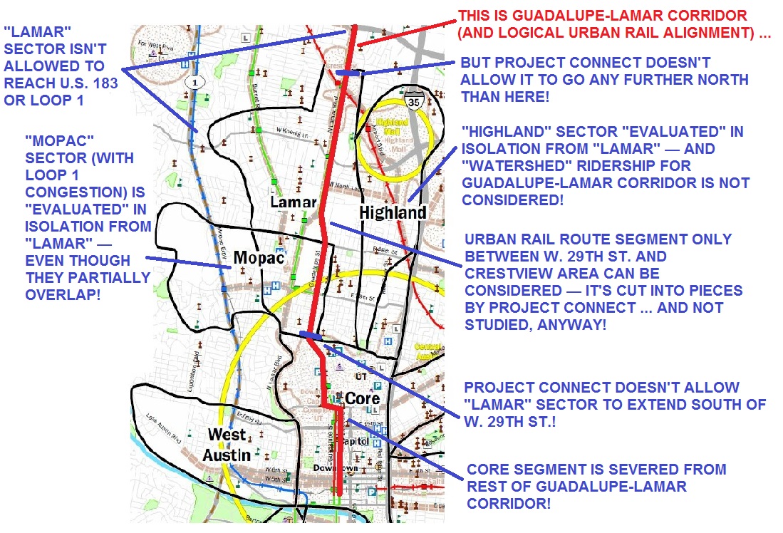
This infographic summarizes numerous major problems with Project connect’s methodology. (Click to enlarge.)
As Austin Rail Now has noted previously, on Nov. 15th, the ProCon planning team are scheduled to recommend a sector (“sub-corridor”) as the basis for further urban rail planning. Given the dubious and even bizarre aspects of their methodology (and the occult nature of their process), predicting what their conclusion will be is somewhat like trying to predict whom the College of Cardinals would elect as a new pope.
In any case, this small analysis underscores that a truly realistic, rational urban rail study would want to look at the population, density, and other key indicators along Guadalupe-Lamar and other entire corridors. And furthermore, that a far more effective methodology for transportation corridor analysis needs to be implemented. So far, Project Connect seems to have made a mess of this process.


[…] • Project Connect’s “corridor” study — without corridors! […]